Charity gift ideas for Christmas

This year, I’ve been shopping for Christmas gifts in the online stores of national charities. It’s the first time I’ve focused my Christmas shopping efforts on charity shops. I wish I’d tried it sooner.

While their product ranges aren’t as extensive as Amazon’s, they do give the impression of being thoughtfully curated selections. And because buying from these shops sends money to good causes, it adds a layer of meaning to the gifts.

The photo below shows a detail from a unisex Christmas jumper sold by the RNLI. In its 202 years of existence, the RNLI has saved many thousands of lives in the seas around Britain and Ireland.

I like the combination of maritime elements and Christmassy snowflakes.
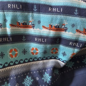
A close-up photo of a patterned jumper. The pattern shows lifeboats, snowflakes, anchors, waves, and life preservers in a repeated pattern.

The two bags in the photo below come from the Red Cross’s online shop. The shoulder bag comes from Nepal and is made of recycled sari material. The tote bag was made from fabric offcuts in Ghana.
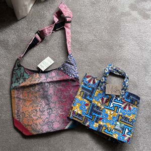
A shoulder bag with a sari pattern on the left and a tote bag with an African pattern on the right.

I also bought a package of red fabric squares from the Red Cross. They’ve been upcycled in England from donated clothes that weren’t suitable to be sold as garments. If you know someone who likes sewing, it’s worth telling them that the Red Cross sells a whole range of colours.
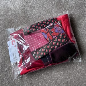
A clear plastic bag of red fabric off cuts

I usually find gift shopping quite stressful at Christmas because it’s a lot all at once. Browsing through charities’ online stores has made the experience far nicer.

RCA webinar on editorial design

I enjoyed watching this Royal College of Art webinar about editorial design in “the post-reading era.” Jeremy Leslie (of magCulture), Astrid Stavro, and Adrian Shaughnessy shared their experiences and observations in a conversation and then answered viewers’ questions.

They gave examples of their favourite books and magazines. If you watch the video, look out for the Anne Frank book. Its designer used a clever layout to represent the teenager’s experience of hiding from the Nazis.

They also spoke about people turning to beautifully designed and fact-checked printed objects as a kind of escape from AI products.

I was particularly struck by one speaker’s story about design choices that didn’t do justice to a writer’s words. It reinforced that the visual appearance of a page can make or break the reader’s experience.

I’m not an editorial designer myself. I’m an admirer, interested in editorial design from an art historical point of view. However, watching this talk did encourage me to buy a couple of books about magazine making. I will try making my own magazine, just to see what it feels like.

Four affordable courses about editorial design and typography

I’m not a graphic designer, but I am interested in how they work on magazines, posters, and other written materials. I studied the history of art with a focus on printed ephemera at university, so you could say that this is a lifelong interest.

To learn more about the people who make printed products attractive, legible, and readable, I’ve been auditing courses on Coursera. Here are four courses I’m following at the moment:

Graphic Design Theory – Hierarchy

Graphic Design Theory – Print Design

Textual Elements of Design – Fonts, Typography, and Spacing

Introduction to Typography

All four courses are delivered through videos and short readings. They explain key concepts in a simple and straightforward way. I’d recommend them to anyone who wants to understand why graphic designers still matter in the age of AI. Their work is about far more than “making things look pretty.” They’re communicators who think carefully about how people interact with digital and printed surfaces.

The “Hierarchy” course explains how graphic designers use the appearance and positioning of letters and numerals to help readers find the information they need. The “Print Design” course, led by the same teacher, expands these principles into the world of printed products such as magazines.

The typography courses focus on typefaces (e.g. Baskerville, Helvetica, Arial) and their impact on readers. They both explain technical terms. “Introduction to Typography” does a deep dive into the history of different lettering. I particularly enjoyed that because I tend to notice variations in typeface across different time periods and cultures.

If you know of similar courses, you’re welcome to drop me a line.