Signs, colours, and a lovely carving

In my previous blog post about photography, I wrote about heavily editing pictures with Snapseed. I wasn’t satisfied with the results and felt that I’d been too heavy handed.

Last weekend, I went out again with an iPhone camera. I cropped the photos but made very few edits this time. Overall, I’m much happier with the results. However, I’ve noticed that the pictures look far better on a phone screen than they do on a much larger computer screen. I guess that may be one of the limitations of camera phone photography.
I took this photo in Birmingham on a sunny day in September 2026. I’d remembered the scene slightly differently, so I was annoyed with myself when I saw it again.
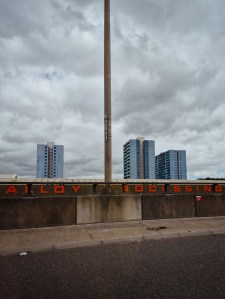
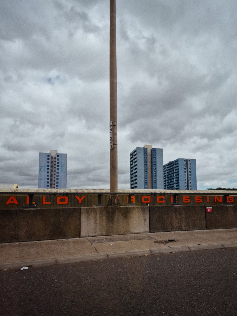
I took the above photo in June 2026, towards the end of a heatwave. It wasn’t raining yet, but the sky was thick with clouds. I don’t think I appreciated how dark this picture is. I’m not sure if it’s because of overediting or simply the weather. I love the colours in this scene. The newer photo does a much better job of capturing them.
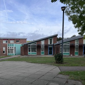
This time around, I tried to pay more attention to colour. This picture above shows a school in Essex. I love this building because of the repeated shapes and the colour on the panels. (September 2026)
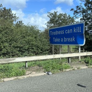
“Tiredness can kill. Take a break.”

I love the blue used on motorway signs. I only noticed the dead bird on the ground after I looked at the photo on my phone. (September 2026)
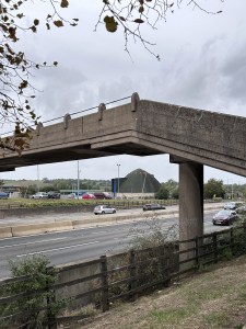
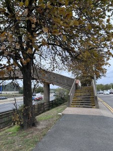
These two photographs show the footbridge at Toddington Services on the M1 motorway. It’s quite unusual to see one without a covered walkway added. This bridge is historic because it dates from the construction of the M1 in the 1950s. I saw it with someone who remembered the M1 when it was new, so that made it quite special. (September 2026)
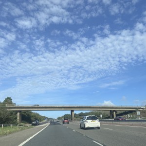
Motorway bridges can be quite beautiful. If you like lines and harmonious balance, they’re well worth looking at. I often think of the bridges in Japanese prints when I see them. (September 2026)
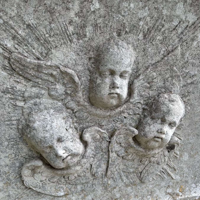
I saw this carving on a tomb in the churchyard of St Peter and St Paul at Stondon Massey in Essex. I’ve edited this photo a little to bring out the lines. There is some orange lichen on this tombstone. I wish I’d taken a few more pictures to capture the lichen and the other carved details. (September 2026)
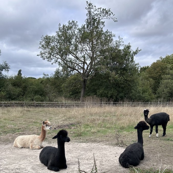
I love the shape of alpacas when they’re sitting down. These animals live at Mulberry House Hotel in Essex. (September 2026)
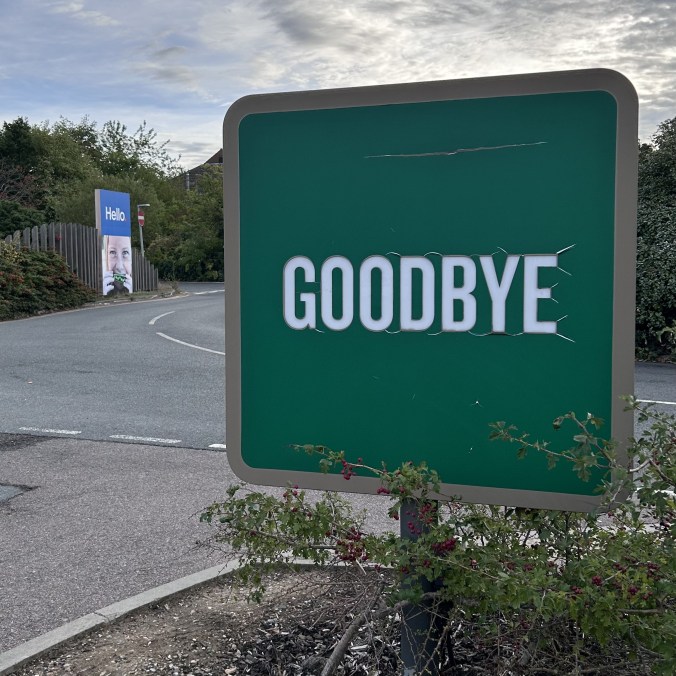
“Hello” and “Goodbye”

I’m fascinated by signage because taken out of context it can look quite odd. I took the above photo at Tesco’s in Harlow in Essex. (September 2026)
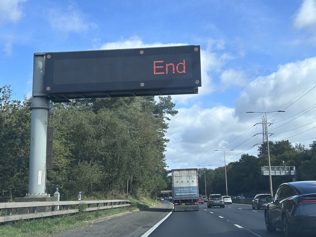
The word “End” has so many different connotations. In this case, it is the end of this blog post. (September 2026)

Empathy, editing, and software QA

I’ve been learning about software quality assurance (QA). I’m a QA proofreader for documents and publications. These two areas of QA look quite different, but they both involve empathy for the reader/user.

To QA a website, you need to understand how people really use it. The QA process aims to catch anything that could cause problems for the user. This includes obvious defects, such as broken links, and areas of friction, such as confusing navigation.

Empathy for users is also important in my area of QA.

We often say that editors and proofreaders are “advocates for human readers.” In addition to looking for mechanical defects such as grammatical mistakes, we’re also alert to areas of friction. For example, an editor commissioned to carry out a Plain English edit would identify complex scholarly phrasing as a friction hotspot.

Software QA and editorial QA take different approaches to testing the reader/user experience.

The Think-Aloud Protocol

The Think-Aloud Protocol tests how real people navigate through a piece of software. Observers watch the test participants without intervening. The participants verbalise their thoughts as they go. This allows the observers to spot which areas of the software run smoothly and which cause friction.

In the editorial QA version of this scenario, there is no test with observers and participants. Instead, the editors or proofreaders are the text’s first external readers. In other words, we’re the first people outside the production team to read the text.

As we read, we observe our own reactions and use our own judgement and experience to think about how other readers may react to the text. What we consider may depend on the instructions in the editorial brief. For example, an editor might focus on accessibility.

Empathy and scope in editorial QA

In editorial QA, exercising empathy for the reader is a matter of scope.

If you ask an editor to perform a heavy edit, you’re really asking them to think deeply about many different aspects of the readers’ experience of the text. The editor will find out who the intended readers are. Then they will use their editorial training and experience to make significant changes to the text to make it more suited to those readers.

This kind of editing is both subjective (the editor’s assessment of readers) and objective (known editorial techniques).

When we’re asked to carry out a lighter edit (such as a light edit, proof-edit, or proofread), we don’t focus so deeply on the readers’ experience. Instead, we look for issues in the text as it stands. Are there:

  • contradictions?
  • ambiguities?
  • inconsistencies?
  • unexpected problems?

Empathy for the reader sometimes comes into it, but not always. Here’s how I would categorise some of the issues I might come across when proofreading.

  • Contradiction: The cat is brown on page 1 and white on page 2. (No empathy needed.)
  • Ambiguity: It’s not clear who is doing what in this sentence. (No empathy needed.)
  • Unexpected problem: The same paragraph is repeated three times. (No empathy needed.)
  • Ambiguity: This word has a double meaning in slang that could embarrass the client. (Protectiveness of client)
  • Unexpected problem: The sudden change of topic confused me and could confuse readers. (Empathy for readers)
  • Unexpected problem: This AI output contains biased attitudes. (Protectiveness of client and empathy for readers)

Naturally, this blog post isn’t a definitive guide to the differences between heavy and light editing. I’ve carried out both, so what I say here is based entirely on my experience.

To me, heavy editing is always very heavily stamped with the question of “What is best for readers?” This is balanced with “How can I preserve what the writer originally said?” The editor has to stay true to the writer’s intention while putting significant changes in place. This is an exercise in empathy in itself.

Lighter editorial work seems to leave a lot more space for the pre-existing wording of writers/clients. This is generally because the aim is to change text only when needed and leave feedback only when necessary.

Shapes and forms in everyday scenes

Like many people, I enjoy taking pictures with my phone. I keep an online photo album on Foto. During the summer, I spent a lot of time following photographers on Instagram. Looking back now in early autumn, I can see how much their pictures influenced my subject choices and photo editing at the time.

The industrial sublime and the beauty of the ordinary are both very popular on Instagram. I can easily understand why. There’s a thrill in spotting beautiful shapes and forms in seemingly everyday scenes. It’s a way to enjoy life as well. Why assume that beauty only exists in popular tourist destinations? Why wait for your holiday to recognise it?

Some Instagram photographers favour an editing style that gives pictures a smooth, glowing sheen. I saw it most often on colour photographs. It’s often used with great results on Americana, such as roadside diner scenes. This look can be achieved in Snapseed by fiddling around with the different tools, including one called “glow.”

You can see these various influences in the photographs in this blog post.

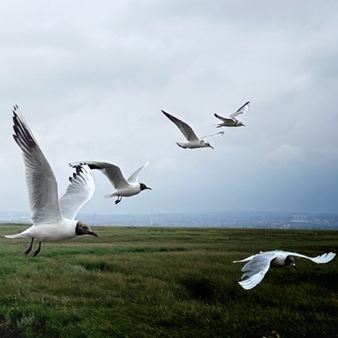
I took the first picture in a village called Parkgate. It shows Black-headed gulls attracted by tourists and their food on the promenade. I’m not sure whether the birds at the back really had such pale heads or whether I overedited the photograph.

Gulls at Parkgate in Cheshire

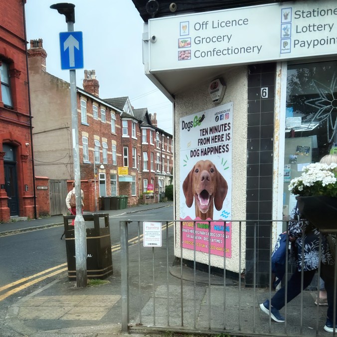
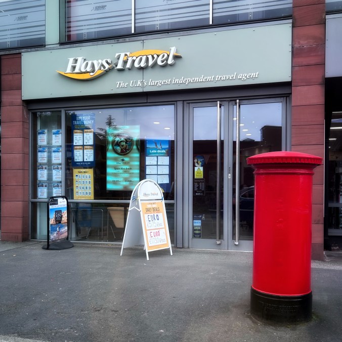
The two street scenes below are quick shots taken through a car window. They’re both somewhere on the Wirral Peninsula. The signage and the colours really caught my eye. “Dog happiness” sounds wonderful.

“Ten minutes from here is dog happiness”
Hays Travel

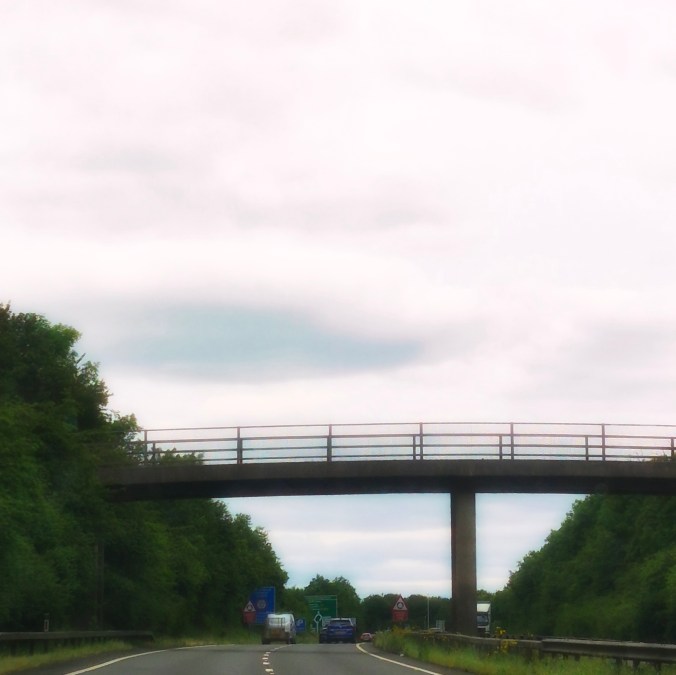
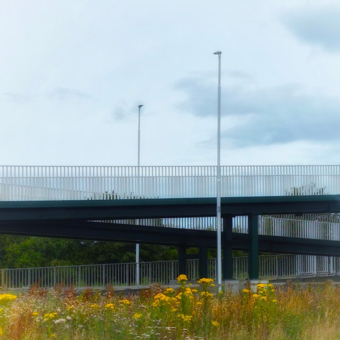
The two photos below show bridges on major roads. As you can see, they’re heavily edited to give them a very glowy look.

The proportions on motorway bridges are often quite beautiful.

Some motorway bridges would make good landscape paintings. I’ve seen several where the bridge, the curve of the road, the surrounding trees, and the colours of nearby lorries combine to create a pleasing scene.

Triangles formed by the exit ramp of a bridge doubling back on itself.

In the picture above and the two below, I liked and still like the repeated shapes.

How many repeating triangles can you see in this picture?
I saw this from a motorway in the Birmingham area. I like the colours.

I’m fond of these photos because they remind me of things I did this year, but I’m not that keen on them aesthetically. I think I went too far with the editing.